svg
CSS + SVG stroke 動態描繪
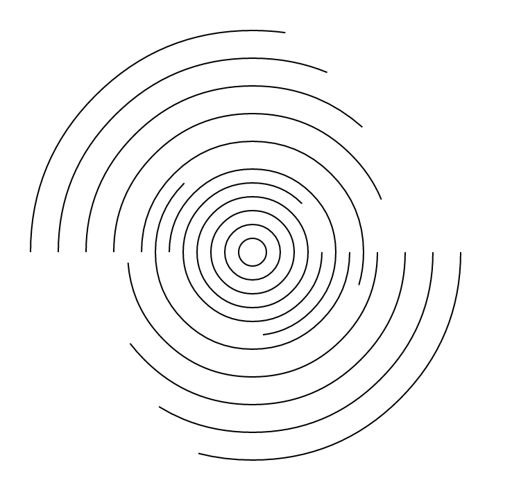
SVG有很多有趣的效果,尤其是stroke,它有許多不同的屬性參數,套用上css animation就有意想不到的效果,雖然不能達到豐富的互動,但至少可以在視覺上令人為之一亮。
這篇要利用stroke的dash特性,做出圖形描繪的動態效果。
參考來源
http://cssdeck.com/labs/ironman-svg-line-animation
作者是把這效果用在描繪鋼鐵人上,做得很酷,而本篇是介紹它的原理。
stroke-dasharray + stroke-dashoffset
stroke-dasharray是把stroke做成了是虛線的效果,線段會被拆成線段、空白、線段、空白,效果就像下面這樣。
/*這邊是CSS*/
line {
    stroke-dasharray: 60;
}
如上顯示,線段被拆成60px的line在空60px的space。
stroke-dashoffset
而stroke-dashoffset屬性是將上面的虛線推移,兩者會有以下幾點特性:
- 推移後,dasharray還是會保持循環。
- dashoffset的值不會大於dasharray。
- 如果dashoffset 等於 dasharray,線段起始點會是空白。
所以這部分就再加上40的stroke-dashoffset來看看結果。
/*這邊是CSS*/
line.l2{
    stroke-dashoffset: 40;
}
如果兩者數值相等,線段的起始點就會呈現空白,這邊先設較小的值(200)。
line.l3{
    stroke-dasharray: 200;
    stroke-dashoffset: 200;
}
如果數值相當的大,就能夠將整個線段隱藏。
結合CSS aniamtion
aniamtion 相關的瀏覽器前輟詞問題,可參考/css/2013/10/17/css-animation-keyframe/
這邊就show重要的CSS code,利用上面的原理將線段隱藏,然後透過animation將線段拉回來,這樣就會有動態描繪的感覺。
//先將stroke隱藏
.stroke{
    stroke-dashoffset: 2000
    stroke-dasharray: 2000
}

//動畫效果 10秒 線性動畫 無限循環
.ani {
    animation: circle-draw 10s linear infinite
}

//keyframes的值
//將dashoffset拉回至0
@keyframes circle-draw{
    80% {
        stroke-dashoffset: 0;
        }
    }
<svg class="stroke ani" height="400" width="100%" >
    <g>
        <circle cx="200" cy="200" r="10"/>
        <circle cx="200" cy="200" r="20"/>
        <circle cx="200" cy="200" r="30"/>
        <circle cx="200" cy="200" r="40"/>
        <circle cx="200" cy="200" r="50"/>
        <circle cx="200" cy="200" r="60"/>
        <circle cx="200" cy="200" r="70"/>
        <circle cx="200" cy="200" r="80"/>
        <circle cx="200" cy="200" r="90"/>
        <circle cx="200" cy="200" r="100"/>
        <circle cx="200" cy="200" r="110"/>
        <circle cx="200" cy="200" r="120"/>
        <circle cx="200" cy="200" r="130"/>
        <circle cx="200" cy="200" r="140"/>
        <circle cx="200" cy="200" r="150"/>
        <circle cx="200" cy="200" r="160"/>
    </g>
</svg>
以上的SVG code,當然這也可以用Illustrator來繪製,只要把svg code換掉就可以了。
注意,儘量不要在網頁上做無限循環的重復播放,很耗效能。